Have you ever felt overwhelmed when faced with a pile of research data? Or are you confused about how to transform raw numbers and facts into a story that's easy to understand, even for a layperson?
Many students and professionals out there experience the same thing. The process of statistical data processing, especially presenting it in an effective visual form, is indeed not an easy task. Yet, the essence of research is how we can communicate findings clearly and convincingly. This is where Bimbingan Informal comes in as a professional academic mentoring service for students and professionals who need assistance with data processing, statistics, visualization, AI, or application coding.
Why Is Statistical Data Processing Important?
Imagine you are building a house. Data is the raw material, and statistical data processing is the process of assembling these materials into a solid foundation. Without a strong foundation, your house certainly won't stand firm, right? The same goes for research.
Statistical data processing is not just about calculating averages or percentages. More than that, this process helps us draw valid conclusions, identify hidden patterns, and test hypotheses. Without appropriate statistical methods, your research findings could be misleading or even indefensible. This is crucial, especially if your research results will form the basis of important decisions or public policies.
Of course, there are various statistical methods you can choose from, ranging from descriptive statistics to describe data characteristics, to inferential statistics to draw conclusions about a population based on a sample. The choice of method largely depends on your research questions and the type of data you have.
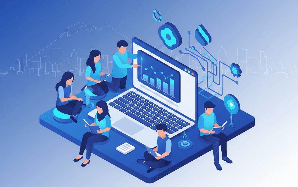
The Power of Data Visualization: Telling Stories with Images
After data has been processed, the next step is to present it. This is where data visualization plays a role. If data processing is the foundation, then visualization is the attractive and functional architectural design of your house. People find visual information much easier to understand than rows of numbers in a table.
A good graph can summarize hundreds of data rows into one informative view. For example, seeing sales trends from a line graph is much faster than scrutinizing monthly spreadsheets. Effective visualization not only beautifies your report but also helps your audience identify patterns, anomalies, and relationships between variables more quickly and intuitively. Remember, the main goal of visualization is not just beauty, but communicative.
There are many types of visualizations you can use: bar charts for comparisons, pie charts for proportions, line graphs for trends, or scatter plots for relationships between variables. Choose the most appropriate visualization type for the message you want to convey. Don't let visualization complicate the information instead.
Essential Tools for Data Processing and Visualization
In this digital age, you no longer need to calculate manually or draw graphs by hand. There are many advanced tools that can help with statistical data processing and visualization:
- Microsoft Excel: For data that is not overly complex, Excel is a familiar and quite capable choice. You can perform various basic statistical calculations and create standard charts.
- R or Python: For deeper and more flexible analysis, programming languages like R or Python with libraries such as ggplot2 (R) or Matplotlib/Seaborn (Python) are the choices of professionals. It takes a little time to learn, but the investment is worthwhile.
- SPSS, Stata, SAS: These are specialized statistical software packages very popular in academic and research environments. They offer a more user-friendly interface for complex statistical analysis.
- Tableau or Power BI: If your focus is more on interactive visualization and dashboard creation, tools like Tableau or Power BI are very powerful. They can transform raw data into dynamic visual stories.
Choose the tool that suits your research needs, skill level, and, of course, your available budget. The most important thing is not the most expensive tool, but how effectively you can use it.
Mastering statistical data processing and visualization requires practice and effort. But don't worry if you feel alone or confused. Bimbingan Informal is ready to assist you, whether you are a student or a professional, at every stage of data analysis. From planning statistical methods, performing calculations, to presenting data in stunning and easily digestible visual forms. With us, your research process will be more focused, and the results will be more optimal. Come on, contact Bimbingan Informal for professional consultation and assistance now!